Emails productivity tricks

I hate managing my mail inbox, and I guess I'm not the only one here. Usually my inbox is for bills, paperwork, to-dos, and so on and anyway most of the items will require me to lose time at something I don't value.

Anyway I'm trying to keep it tidy and nice to open and here are some of the habits I'm using to manage the load of documents.

Automate

Most of the emails with attachment and invoice somewhere in the object/title and sent to my accounting software running in the clouds. Other emails can just be automatically archived under some conditions.

Label everything

This is likely nothing new, but getting the discipline to achieve this in the long run is what matters. In Gmail I often use the "Filter similar items" to automatically label similar emails.

Labeling alone is a nice trick which gets even more powerful with colors and emojis.

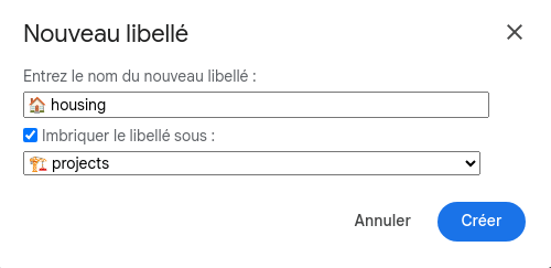
When I added this new label for dealing with my automated research of places, I've been creating this "housing" label with a 🏠️ emoji, and placed it under the πŸ—οΈ projects label for now.

Colorize

Green for good things, orange for what things that can drain money or energy.
For instance paid invoices and refund are in green and unpaid invoices, fines, taxes are in orange/red.
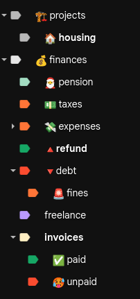
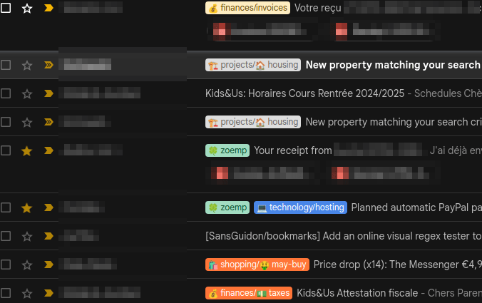
With those labels and colors, because I rely a lot on visual memory, I can get a good sense of my priorities without having to spend much time in my Inbox by reading emails titles.
Delete handled items

Once something is done, there is no point to keep it nor archive it, unless it's something I'm really too afraid to lose for now, then I can archive it so the email can be found later.

Delegate

My time is not more valuable than other people time, but I do value some things more than others, and I try to focus on what matters for me and delegate other emails if possible, for instance I ignore some emails sent to our company because I know my partner handles those specific ones. If I'm not sure my partner is dealing with something, I'm just forwarding the email with a communication for her.

Unsubscribe

I almost forgot that must-know trick, which is quite underrated and no so commonly used among family members, which is a pity. Whenever you receive recurrent emails you have no time to read, just unsubscribe from them, even if they make it difficult sometimes.

No newsletter please

I prefer to get news by RSS on my Miniflux instance, so everything that can be turned to a RSS feed will be, and every newsletter that does not propose a RSS feed, I'll convert it to a RSS feed via https://kill-the-newsletter.com/, and if the blog I want to subscribe to is banning such automation, I'll use RSS-Bridge to generate a RSS feed by scrapping the content of their blog.

Snooze

Sometimes there is nothing you can do with an email, yet. For instance it's the tracking number of a delivery package, and the package won't be there before 3 days. Or it's a very detailed email for your hotel or event booking for in a few months in the future. In such cases I just snooze such emails for a future date.

Dark mode

I try to make my emails boring and so reduce the anxiety they cause me, and for this Gmail proposes a Dark mode. If that's not enough you can also try some extensions that turn Grayscale / Monochrome mode on. For instance on Brave (Chrome based browser) I'm using this one below.

Dark patterns collection

i.e UX patterns that make me feel like I should report to https://grumpy.website/.

I'm regularly battling to browse the web like before and maintain Inbox Zero for my work and personal mailboxes and I have to say it's not a fun game. Especially when some crappy tactics at are play like below.

Let's start a collection with the patterns I criticize and update this post regularly with findings.

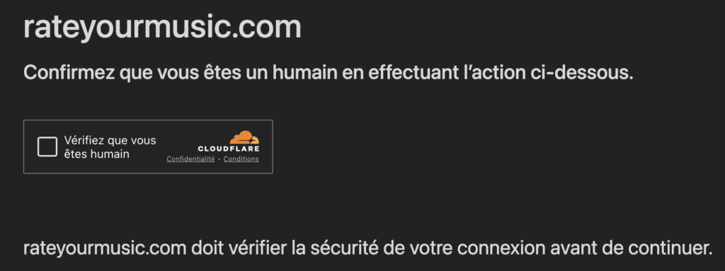
CloudFlare (via RYM / rateyourmusic.com and many others)

Every few clicks when browsing their website with my paid account, I'm facing this "human status check" which is a big annoyance. I've informed them it's a pain, especially every few clicks and as a subscribed user. They promise their developers are working on it. We will see...

Elastic.co

First example is Elastic (elastic.co), with a work email I never asked for, inviting me to a local event. The email is long and I don't care about the Pizza party at all which is the first thing they mention in their agenda. I want to stop receiving such emails.

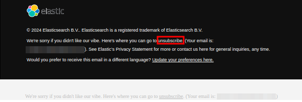
Looking at the bottom of their email, I notice a first unsubscribe button.

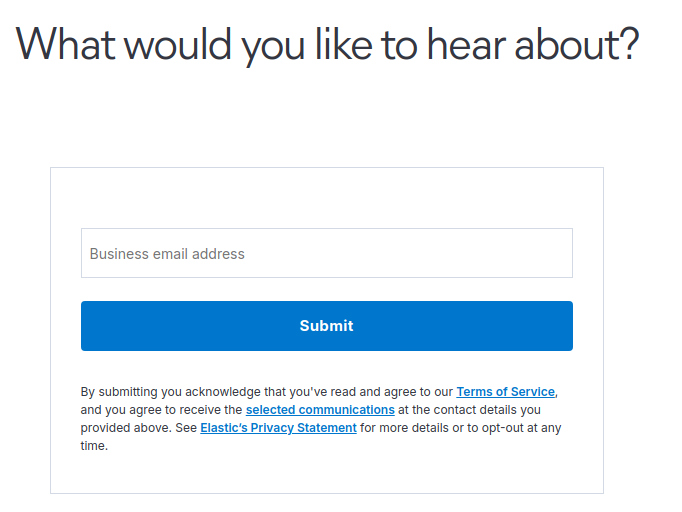
It redirects to a subscription page... (see below). Clever... !

When looking more closely, there is a second unsubscribe button, very hard to see due to the lack of contrast.

Who has then time to fill their unsubscribe form ? Not every weirdo. But that's it seems the effort which is due just for allowing me to regain a little more quiet in my mailbox. So now you know.

Homebrew (Mac)

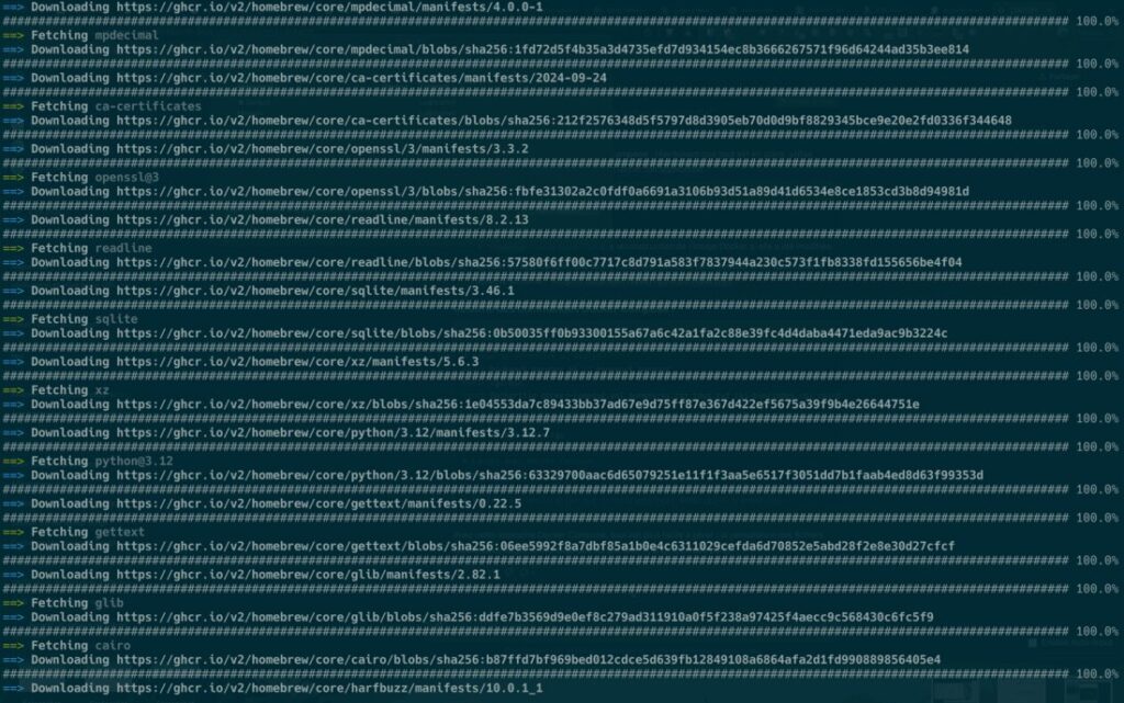
You use brew install to run a small utility binary and ... you scroll through 630 lines of output and recompilation to see if your utility is finally there. WHY. SO. MUCH. OUTPUT.

Medium

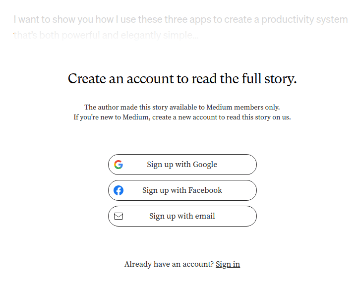
No, you shall not ask my private data show me some HTML on the web. Well tried but nope.

I won't trust your doomed kingdom. Related: Don’t build your castle in other people’s kingdoms.

OpenAI / ChatGPT

I regularly have to play a few puzzles successively. In average 2 or 5. If you fail, you start over. It's very time consuming.

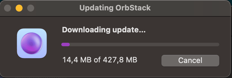
OrbStack updates

Leave me develop please.

RateYourMusic / Sonemic

This ones make me sad as RYM belongs to my favorite bookmarks. We are punished with this "prove you are human" form every few clicks. So annoying.

And also, from time to time.... Thank you CloudFlare.

NodeBB

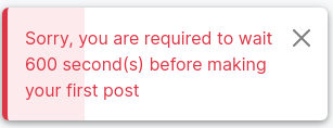
Preventing users from contributing a forum for some arbitrary period is quite stupid especially if done AFTER you accept their account registration.

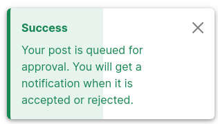
Once the waiting period is completed, the post is queued. This is better, yet annoying of course.

OVH

After months with Contabo (VPS), I decided it was time to close my domain and hosting subscriptions managed at OVH. I disabled the automated renewal a few weeks ago, and managed to setup redirects on my old websites. My subscriptions should be cancelled automatically but I can't wait and I want to get that out of my mind, so I want to force a manual cancellation.

To my surprise, it took me a lot of emails and exchanges with support. I understand the security measures and no one would like its accounts and services revoked by accident.

The problem is mostly the poor UX and customer support for getting this done. Let dig deeper.

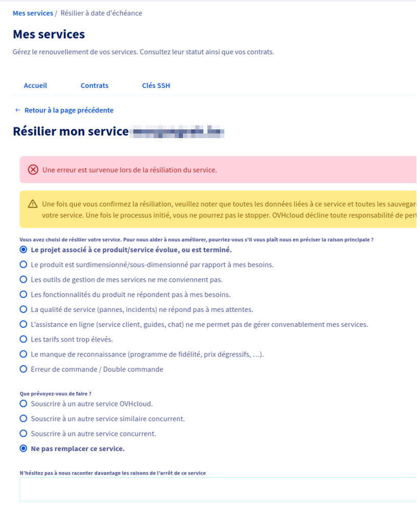
When trying to cancel any service, I just get error without explanation nor resolution steps.

Later did I find emails from OVH asking me to confirm my revocation, so I could at least complete some of the steps, but it required me to leave my workflow and switch from my admin panel to emails, then manage those emails, then double check my admin panels for updates of services statuses...

In the end I opened a ticket to OVH support asking them to delete my account and the related services. They closed the ticket asking me to close my account only after services are revoked, which let me again with an unresolved solution.

I had to reopen the ticket and provide them the evidence above so they know I can't close some of my services. Closing a customer complaint on user's behalf without asking feedback is probably a tactic for improving their KPIs, but it ultimately tell they consider their customers to be nothing more than complainers with no real problem to be solved. This also tell the culture of OVH has diverged from customer first. No wonder I'm leaving you, OVH, as I'm expecting more from a service provider.